


There is a particular feeling that comes with walking into a room that is truly right. Not just beautiful — right. The furniture feels like it belongs. The art looks like it was always there. The lighting feels generous without being overwhelming. Everything has room to breathe, and yet nothing feels lost or insignificant.
Most people attribute this feeling to good taste. And while taste certainly plays a role, what is actually happening in those rooms is something more precise. It is scale and proportion working so well together that the result feels effortless — invisible, even. You don’t notice the decisions. You just feel the outcome.
The opposite is equally true. When a room feels off — when something nags at you even though you can’t quite name it — scale and proportion are almost always the culprit. The sofa is too small for the wall behind it. The rug floats in the center of the room without touching the furniture. The pendant over the island looks timid rather than considered. These are not taste problems. They are proportion problems. And they have solutions.
This is my guide to the invisible rules that make rooms feel right — and the adjustments that fix them when they don’t.
What Scale and Proportion Actually Mean
Before anything else, it helps to understand what these two words actually mean in practice — because they are often used interchangeably when they are in fact two distinct things.
Scale refers to the size of an object relative to the space it occupies. A dining table is the right scale for a room when it fills the space with appropriate generosity — not so small that the room dwarfs it, not so large that it crowds every other element out. Scale is about the relationship between a single object and its environment.
Proportion refers to the relationship between objects relative to each other. A sofa is well-proportioned to a coffee table when the table is roughly two-thirds the length of the sofa. A mirror is well-proportioned to a vanity when its width relates meaningfully to the vanity below it rather than to the wall behind it. Proportion is about the relationship between multiple elements working in the same composition.
Both matter enormously — and a room can fail on either count. A room with well-proportioned furniture that is collectively too small for the space has a scale problem. A room with appropriately scaled furniture arranged without proportion between pieces has a proportion problem. The goal is to get both right simultaneously.
Scale is the relationship between an object and its space. Proportion is the relationship between objects with each other. A beautiful room gets both right.
The Rug: The Most Common Scale Mistake in Any Room
If I had to name the single most common scale mistake I see in homes, it would be the rug — specifically, a rug that is too small for the space it is meant to anchor.
An undersized rug does something visually damaging that is immediately felt even when it cannot be named. It makes the furniture appear to float rather than be grounded. It makes the room feel smaller rather than larger. And it draws the eye downward to something that looks like an afterthought rather than a considered design decision.
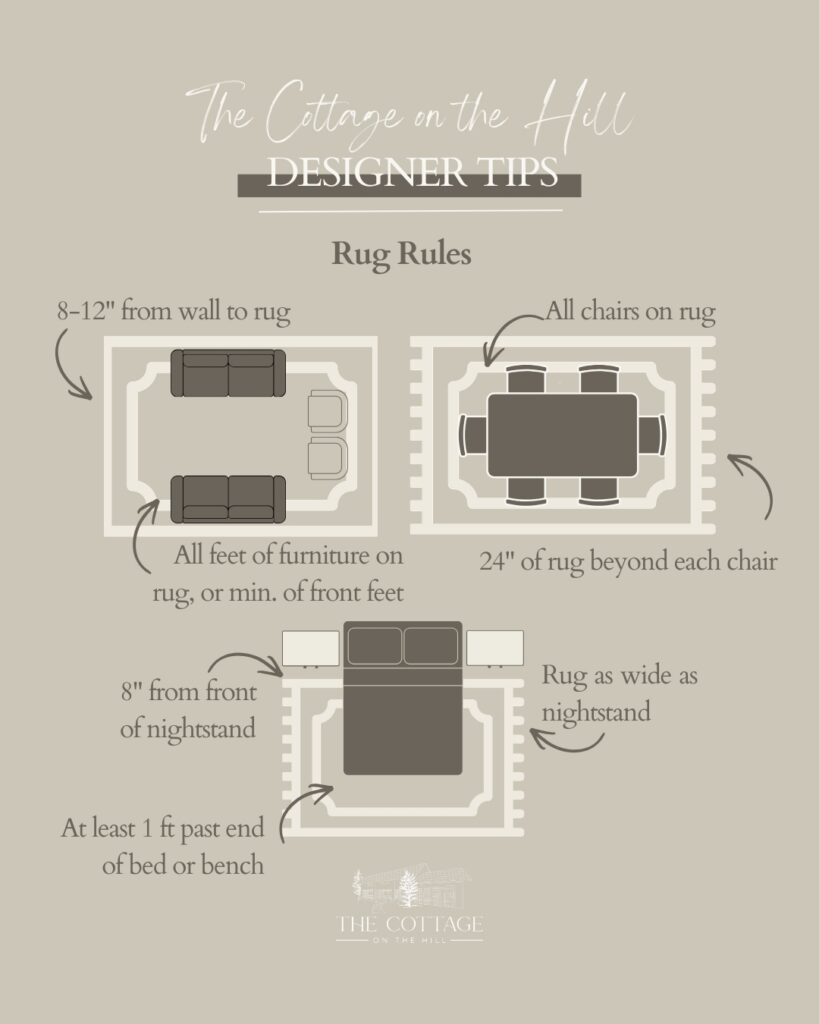
The fix: In a living room, the rug should sit under at least the front legs of all main seating pieces — ideally under all legs of the sofa and chairs for a fully grounded composition. In a dining room, the rug should extend far enough beyond the table that chairs remain fully on the rug even when pulled out for seating. A good starting point is to add at least 24 inches to the table dimensions in every direction.
The rule of thumb: When you think you have found the right rug size, go one size up. Almost without exception, the larger rug will look better. The most common regret I hear from clients who chose their own rugs before working with a designer is that they went too small.
In a bedroom: The rug should extend generously on both sides of the bed and at the foot — enough that your feet land on it when you rise in the morning. A rug that only peeks out from under the bed frame is doing very little for the room.
The rug anchors the room — when it is the right size, the furniture looks placed. When it is too small, everything floats.
Furniture Scale: Filling the Room with Appropriate Generosity
Furniture scale is the most visible proportion decision in any room, and it is where many otherwise well-intentioned rooms go quietly wrong.
The most common error is choosing furniture that is too small — whether from a concern about overwhelming the space, a desire to leave more floor visible, or simply an underestimation of how much visual mass a room actually requires to feel furnished rather than sparse. A room filled with appropriately scaled furniture feels generous and considered. A room filled with furniture that is too small feels under-resourced, regardless of how beautiful the individual pieces are.
The sofa: In a living room, the sofa should feel substantial — not dainty. A sofa that is too small for its wall looks uncertain. As a general guideline, the sofa should occupy roughly two-thirds to three-quarters of the wall it sits against. If your sofa looks lost against its wall, the sofa is likely too small, or the room needs an additional seating piece to balance the composition.
The dining table: A dining table should fill its room with confidence. Too often I see a dining room where the table has been chosen conservatively — seated for six when the room could hold eight, scaled modestly when the architecture called for something more commanding. A dining table that is too small for its room makes the room feel unresolved. Round tables in particular can disappear in a space that needs something with more horizontal presence.
Accent chairs: Accent chairs are one of the most common scale missteps. A small accent chair placed in a large living room as a design gesture — rather than a functional seat — almost always reads as insufficient. If an accent chair is going to be in the room, it should be scaled to contribute to the conversation rather than sit apologetically in a corner.
The fix: Before ordering any large piece of furniture, tape out its footprint on the floor. Stand at the entry of the room and look at it in context. This simple step catches more scale mistakes than any measurement alone.
Furniture should fill a room with appropriate generosity — when in doubt, scale up rather than down and let the room breathe around the pieces.
Lighting Scale: The Pendant Problem
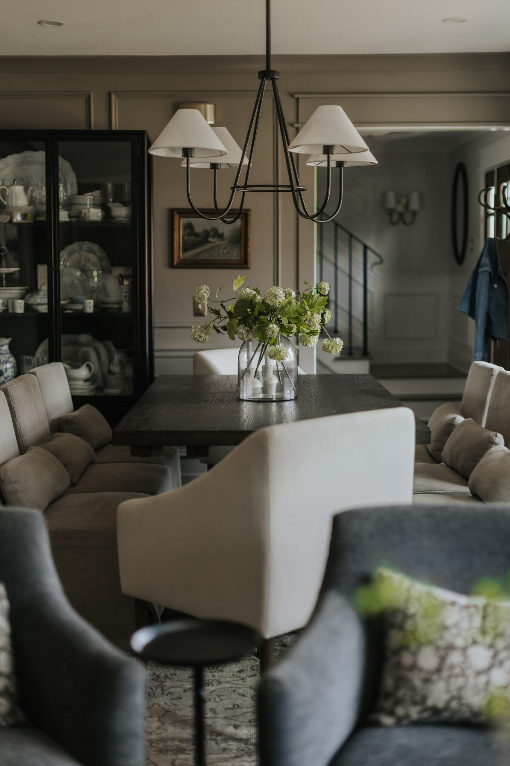
Lighting is where proportion mistakes are most immediately visible — and most often made. Specifically, pendant lights hung over islands and dining tables are among the most common proportion failures I see, even in otherwise beautifully designed rooms.
The mistake almost always takes the same form: pendants that are too small, hung too high, doing too little for the space they are meant to anchor. A single small pendant over a large island looks like a question mark. Two small pendants hung too high look like afterthoughts. The effect is a room that reads as almost right — a room that makes you feel something is missing without being able to identify what.
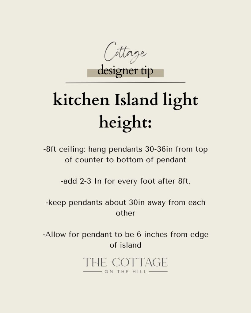
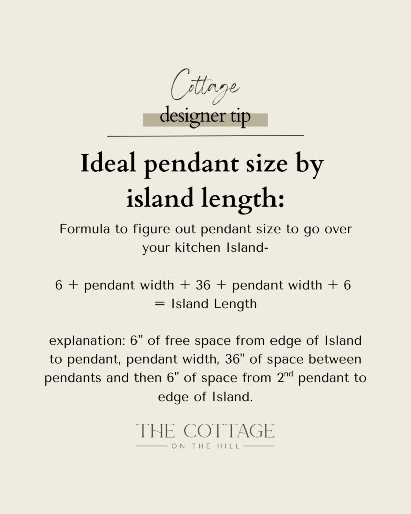
Island pendants: As a general rule, pendants over a kitchen island should fill roughly two-thirds of the island’s length when grouped together. If you have a 96-inch island and are using two pendants, each pendant should be substantial enough that the two together read as a considered composition rather than two isolated points of light. Hang them between 30 and 36 inches above the counter surface — low enough to create intimacy and visual connection with the island below.
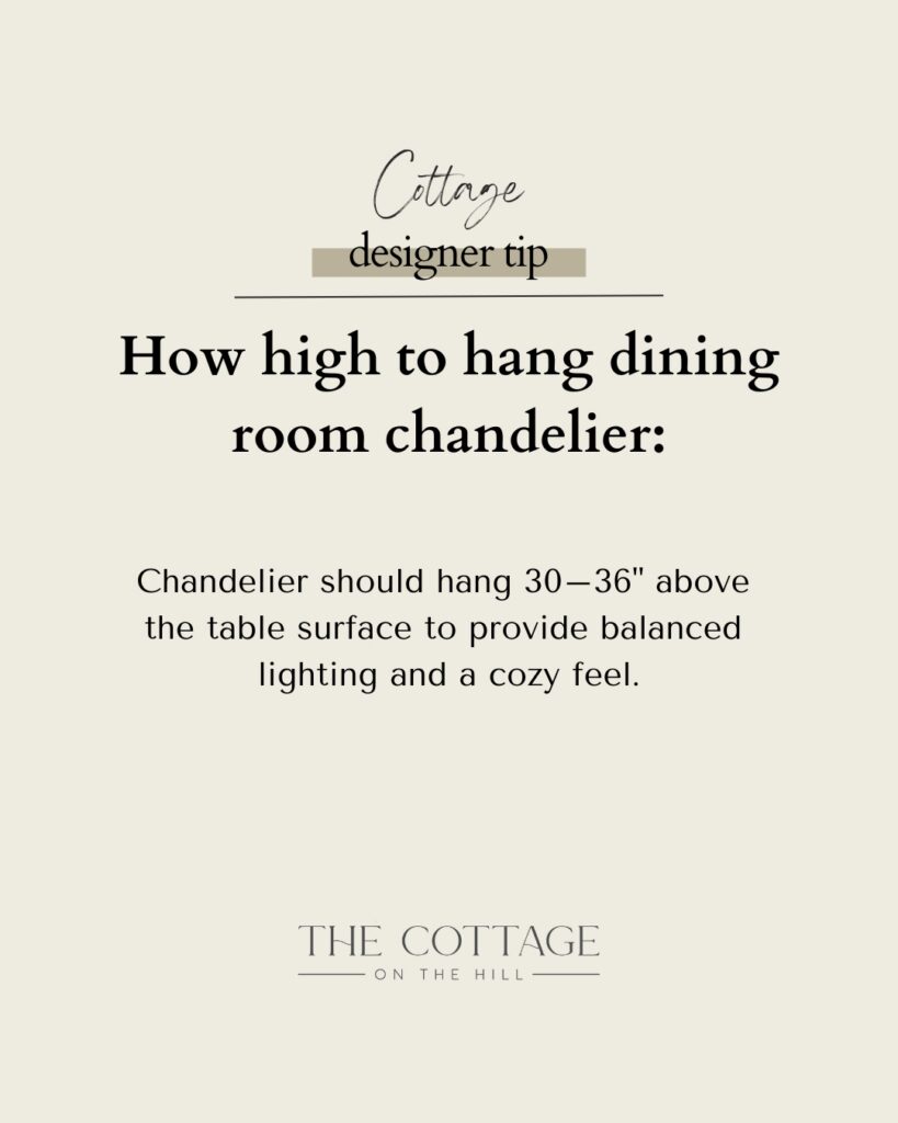
Dining pendants and chandeliers: A chandelier over a dining table should be approximately one-half to two-thirds the width of the table. For a 60-inch round table, a chandelier in the 30 to 36-inch diameter range reads as proportionate. Hang it 30 to 34 inches above the table surface for the most intimate, flattering light.
The fix for lighting that reads as too small: Before replacing a pendant entirely, try lowering it. Dramatically lowering a light — even one that is slightly undersized — can transform its presence in a room. The closer a light source is to the surface it illuminates, the more connected it feels to the composition below it.
Lighting scale is immediately felt even when it cannot be named — pendants that are too small or hung too high make an otherwise beautiful room feel unresolved.
Art and Mirrors: Proportion to the Object Below, Not the Wall
Art and mirror proportion is perhaps the most misunderstood of all the invisible rules — and the most frequently applied incorrectly even by people who consider themselves design-aware.
The most common mistake: sizing a mirror or piece of art to the wall it hangs on rather than to the object it sits above. A mirror hung above a console table should relate proportionally to the console — not to the entire wall behind it. A piece of art above a sofa should feel connected to the sofa below — not attempting to fill the wall on its own terms.
Mirrors above a console or vanity: The mirror should be no wider than the surface below it — and ideally slightly narrower, leaving a few inches of breathing room on each side. A mirror that is significantly wider than the console below it loses its connection to the furniture and reads as a wall feature rather than a composed moment. A mirror that is appropriately proportioned to the console below creates a unified, intentional vignette.
Art above a sofa: The art should span approximately two-thirds to three-quarters of the sofa’s length. A single piece of art that is too narrow above a long sofa looks orphaned. A gallery wall that extends significantly wider than the sofa below it loses its connection to the furniture. The visual relationship between the art and the sofa is what creates the composed quality that makes a living room feel finished.
Art scale in general: The most common art mistake is going too small. A single piece of art on a large wall needs to be larger than most people initially choose. When in doubt, mock it up with kraft paper before ordering or hanging — the paper will almost always tell you to go bigger.
The fix: Measure the furniture first. Then select art and mirrors that relate to those measurements rather than to the wall dimensions. The wall is the context. The furniture is the anchor.
Art and mirrors should relate proportionally to the objects below them — size to the furniture first, and let the wall be the backdrop.
Architectural Proportion: The Bones That Make Everything Else Work
There is a reason that rooms in older homes often feel so right even before a single piece of furniture is placed. It is not accident or nostalgia — it is architectural proportion. Tall baseboards. Deep crown moulding. Cased openings with proper reveals. Windows with appropriate trim depth. These architectural details give a room its skeleton, and a well-proportioned skeleton makes everything placed inside it feel resolved.
In newer construction especially, where trim is often builder-grade and minimal, rooms can feel flat regardless of how beautifully they are furnished. Adding architectural proportion through millwork — beefed-up baseboards, picture frame moulding on walls, beadboard ceilings, properly cased doorways — is one of the highest-impact investments you can make in any room. It is the difference between a room that feels like a backdrop and a room that feels like a destination.
Crown moulding height: Crown moulding should be sized to the ceiling height. A small, delicate crown on a ten-foot ceiling looks insufficient. A generous, deep crown — three to five inches or more — gives the ceiling the visual weight it needs to feel connected to the walls below it.
Baseboard height: As a general rule, baseboards should be taller than you think. In a room with eight-foot ceilings, a four to five-inch baseboard reads as considered. In a room with ten-foot ceilings, six to eight inches or more. The baseboard grounds the room — it is the visual transition between the floor and the wall, and when it is too small, the room reads as unfinished regardless of everything above it.
The fix: If your room feels flat despite beautiful furniture and styling, look at the architecture first. Adding or upgrading millwork is almost always the answer — and it is a permanent investment that makes every other design decision look better.
Architectural proportion is the skeleton that makes everything else feel right — invest in the bones and the room will reward you indefinitely.
The Room That Feels Off: A Diagnostic Approach
When a room doesn’t feel right and you can’t name why, scale and proportion are always the first place I look. Here is how I think through it.
Step back to the entry point of the room and look at it as a whole. Where does your eye go first? Is there a natural focal point, or does the eye move restlessly without landing anywhere? A room with good proportion has a clear visual hierarchy — a place for the eye to arrive, rest, and then move through the space comfortably.
Assess the rug first. Is it large enough to anchor the furniture? If anything in the room floats, the rug is almost always the culprit.
Look at the furniture relative to the walls. Do the major pieces fill the room with appropriate presence, or do they look tentative against the architecture around them?
Look at the lighting. Are the pendants or chandelier the right scale for the table or island below? Are they hung at the right height to create connection rather than distance?
Look at the art and mirrors. Do they relate to the furniture below them, or are they sized to the wall independently?
Look at the architecture. Are the baseboards and crown moulding proportionate to the ceiling height? Is the trim giving the room its bones, or is it disappearing into the background?
Almost always, one of these assessments will identify the source of the unease. And almost always, the fix is simpler than it first appears.
A room that feels off almost always has a proportion problem — step back, assess each layer in sequence, and the answer will reveal itself.
Scale and proportion are the invisible rules — the ones no one talks about at a dinner party, the ones that don’t appear on a mood board, the ones that work entirely below the level of conscious awareness. But they are the rules that determine whether a room feels genuinely right or just almost right. Whether it feels resolved or perpetually in progress.
Getting them right is not complicated. It requires measurement, patience, and the willingness to go bigger than your instinct initially suggests. It requires looking at furniture relative to walls, art relative to furniture, lighting relative to surfaces, and architecture relative to ceiling height.
Do this with intention and consistency, and the rooms you create will have that quality — the one that is difficult to articulate but impossible to miss. The one that makes people pause in the doorway before they can explain why.
Ready to apply these principles in your own home? Head to my LTK for the furniture, lighting, art, and architectural details that bring beautiful proportion to life.