


There’s a common misconception that creating a cozy home means filling it with only warm tones—honey woods, brass, cream, and caramel at every turn. But I’ve found the opposite to be true: the coziest spaces are actually the ones that balance both warm and cool tones together.
All-warm rooms can feel heavy or overly cozy to the point of feeling closed in. All-cool spaces can read as sterile or uninviting. But when you thoughtfully layer warm and cool tones together, something magical happens. The room finds equilibrium. It feels grounded yet fresh, cozy yet breathable, inviting yet calm.
This balance isn’t about formulas or perfect ratios. It’s about understanding how tones interact, where to anchor warmth, and when to introduce coolness for contrast and clarity. It’s one of the most powerful tools in creating spaces that feel truly cozy—not just warm, but balanced in a way that makes you want to stay.
This is the art of tonal balance, and it’s how I create the kind of coziness that feels timeless rather than heavy, inviting rather than overwhelming.
Understanding Warm vs. Cool
Before we talk about balance, let’s clarify what we mean by warm and cool tones.
Warm tones have yellow, orange, or red undertones. Think honey-toned woods, terracotta, brass, camel leather, creamy whites, warm grays with beige undertones. These colors make a space feel inviting, cozy, and grounded.
Cool tones have blue, green, or gray undertones. Think blue-grays, sage greens, cool whites, polished nickel, marble, linen in soft grays. These colors bring freshness, clarity, and a sense of calm.
Most colors aren’t purely warm or purely cool—they lean one direction. A gray might have warm taupe undertones or cool blue undertones. A white might read creamy and warm or crisp and cool. Learning to see these undertones is the first step in creating balance.
Understanding undertones is the foundation of creating tonal balance.
Start with Your Anchor
Every room needs an anchor—something that grounds the space and guides every other decision.
Often, this anchor is warm. A wood floor, a kitchen island in walnut, a beautiful warm-toned rug. When your anchor is warm, you have the freedom to layer in cooler tones through paint, textiles, metals, and accents. The warmth keeps the space feeling inviting while the cool tones bring balance and breathing room.
Sometimes, the anchor is cool—marble countertops, cool gray walls, or stone tile. In these cases, you’ll want to intentionally bring warmth through wood tones, brass or bronze hardware, warm textiles, and accessories. The cool foundation creates calm, and the warm layers create coziness.
Identify your anchor first. Then build around it.
Your anchor tone—warm or cool—guides everything else in the room.
Layer Warm Wood Tones with Cool Neutrals
This is one of my favorite and most reliable combinations.
Warm wood floors or cabinetry paired with cool-toned paint—soft gray-blues, true grays, or crisp whites with blue undertones. The warmth of the wood keeps the space from feeling cold, while the cool paint adds freshness and keeps it from feeling too heavy or traditional.
I use this approach constantly. Walnut cabinetry with cool gray walls. Honey oak floors with soft blue-gray paint. Natural wood shelving against a backdrop of Extra White. The wood brings soul and warmth, the cool paint brings clarity and calm.
Warm woods and cool neutrals create the perfect push and pull—grounded yet fresh.
Use Metallics to Shift the Temperature

Hardware, lighting, and metal finishes are subtle but powerful tools for adjusting a room’s temperature.
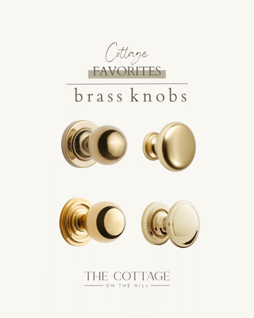
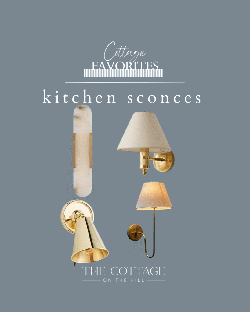
Brass, bronze, and gold-toned metals add warmth. They bring richness, a sense of history, and coziness. If your space feels too cool or sterile, adding warm metal hardware or a brass light fixture can shift the entire feeling.
Nickel, chrome, and silver-toned metals add coolness. They bring crispness, modernity, and clarity. If your space feels too warm or heavy, introducing cooler metal finishes can create balance and breathing room.
I often mix metals within a space—warm brass cabinet pulls with a cooler nickel faucet, for example—but I’m always conscious of which tone is dominant and what the room needs.
Metals are your secret weapon for fine-tuning a room’s temperature.
Textiles Bring Temperature and Softness

Fabric is where you can play with warmth and coolness in ways that feel natural and layered.
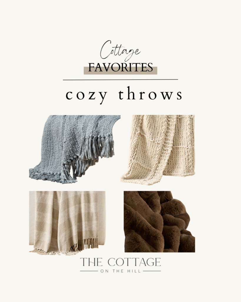
Linen often reads cool—especially in grays, blues, and soft whites. Wool, velvet, and chunky knits tend to read warm. Leather can go either way depending on the tone—camel and cognac are warm, gray and black are cool.
In a room with cool paint and marble, bring in warm textiles: a caramel leather chair, a cream wool throw, linen pillows in warm taupe. In a room with warm wood and brass, layer in cooler textiles: soft gray linen curtains, blue-toned pillows, a jute rug with cool undertones.
Textiles soften the edges and allow you to adjust the balance without committing to permanent changes.
Textiles give you flexibility—they’re the easiest way to shift temperature and add layers.
Stone and Tile Set the Tone
Natural stone and tile have inherent temperatures, and they significantly impact the overall feeling of a space.
Marble—especially white marble with gray veining—reads cool. It’s elegant, classic, and brings a sense of calm and clarity. Honed marble softens the coolness slightly but still leans in that direction.
Limestone, travertine, and warmer stones with beige or cream tones bring warmth. They feel earthy, organic, and grounded.
Subway tile in pure white is cool and crisp. The same tile in a warm cream or off-white shifts warmer and softer.
When choosing stone and tile, consider what temperature your room needs. If you’re installing cool marble countertops, plan to bring warmth through wood, brass, and textiles. If you’re using warm limestone, you can afford to go cooler with paint and metals.
Stone and tile are foundational—their temperature affects the entire space.
Paint Creates the Backdrop
Paint is one of the most powerful tools for establishing temperature, and it’s also one of the easiest to get wrong if you don’t pay attention to undertones.
A white with blue or gray undertones (like Extra White or Pure White) reads cool. It creates crispness and clarity, especially in spaces with lots of natural light. Pair it with warm woods and brass to balance the coolness.
A white with cream or yellow undertones (like Alabaster or White Dove) reads warm. It creates softness and coziness. Pair it with cooler metals or blue-gray accents to keep it from feeling too heavy.
Grays are tricky because they can lean warm (greige) or cool (blue-gray or true gray). Always test your paint in the actual space with the actual light. What looks cool in the store might read warm on your walls, and vice versa.
Paint sets the temperature for the entire room—choose your undertones wisely.
Create Contrast, Not Competition
The goal of balancing warm and cool isn’t to have equal amounts of each—it’s to create intentional contrast that feels harmonious.
If your dominant tone is warm (wood floors, brass hardware, warm paint), introduce cool accents strategically. A blue-gray island in an otherwise warm kitchen. Cool linen pillows on a camel leather sofa. Polished nickel faucets with brass cabinet pulls.
If your dominant tone is cool (gray walls, marble counters, chrome fixtures), layer in warmth thoughtfully. Wood cutting boards and bowls on marble counters. A warm wood dining table in a cool-toned room. Brass picture lights on gray walls.
The contrast should feel like a conversation, not a conflict. Each temperature should enhance the other, not fight for dominance.
Balance doesn’t mean equal—it means one tone grounds while the other lifts.
Trust the Light
Natural light dramatically affects how warm and cool tones read in a space.
North-facing rooms receive cooler, bluer light. In these spaces, warm tones are essential—they counteract the coolness of the light and keep the room from feeling flat or cold. Use warm wood, warm whites, and brass generously.
South-facing rooms receive warm, golden light. Here, you can afford to go cooler with your tones. Cool grays, true whites, and cooler metals will still feel balanced because the light adds warmth.
East-facing rooms get warm morning light and cooler afternoon light. West-facing rooms are the opposite. Consider how you use the room and when, and choose tones that support the quality of light at those times.
Always test paint and materials in your actual space, at different times of day, before committing.
Light changes everything—what works in one room may not work in another.
Layer Gradually and Observe
Creating tonal balance isn’t something you do all at once—it’s something you build over time.
Start with your anchor (floor, cabinetry, or dominant paint color). Add your next largest element (walls, countertops, or major furniture). Then layer in metals, textiles, and accents, paying attention to how each addition shifts the temperature of the room.
Step back often. Does the room feel too warm and heavy? Add something cool—a blue-gray pillow, a cooler piece of art, nickel hardware. Does it feel too cool and stark? Bring in warmth—a wood cutting board, brass candlesticks, a warm throw.
This gradual layering allows you to respond to what the room actually needs rather than following a predetermined plan that might not work once everything is in place.
Balance reveals itself over time—layer gradually and trust your eye.
Examples of Beautiful Balance
Let me paint a few pictures of what this balance looks like in practice.
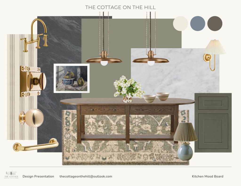
A kitchen with warm wood tones in the island and flooring, sage-green painted cabinetry, light marble or quartz countertops, and brass hardware and pendant lights. The wood brings organic warmth and grounds the space. The sage-green reads cool but soft, adding calm without feeling cold. The marble provides cool clarity, while the brass hardware and lighting pull everything together with an extra layer of warmth. The result: a kitchen that feels both earthy and fresh, lived-in and elevated.
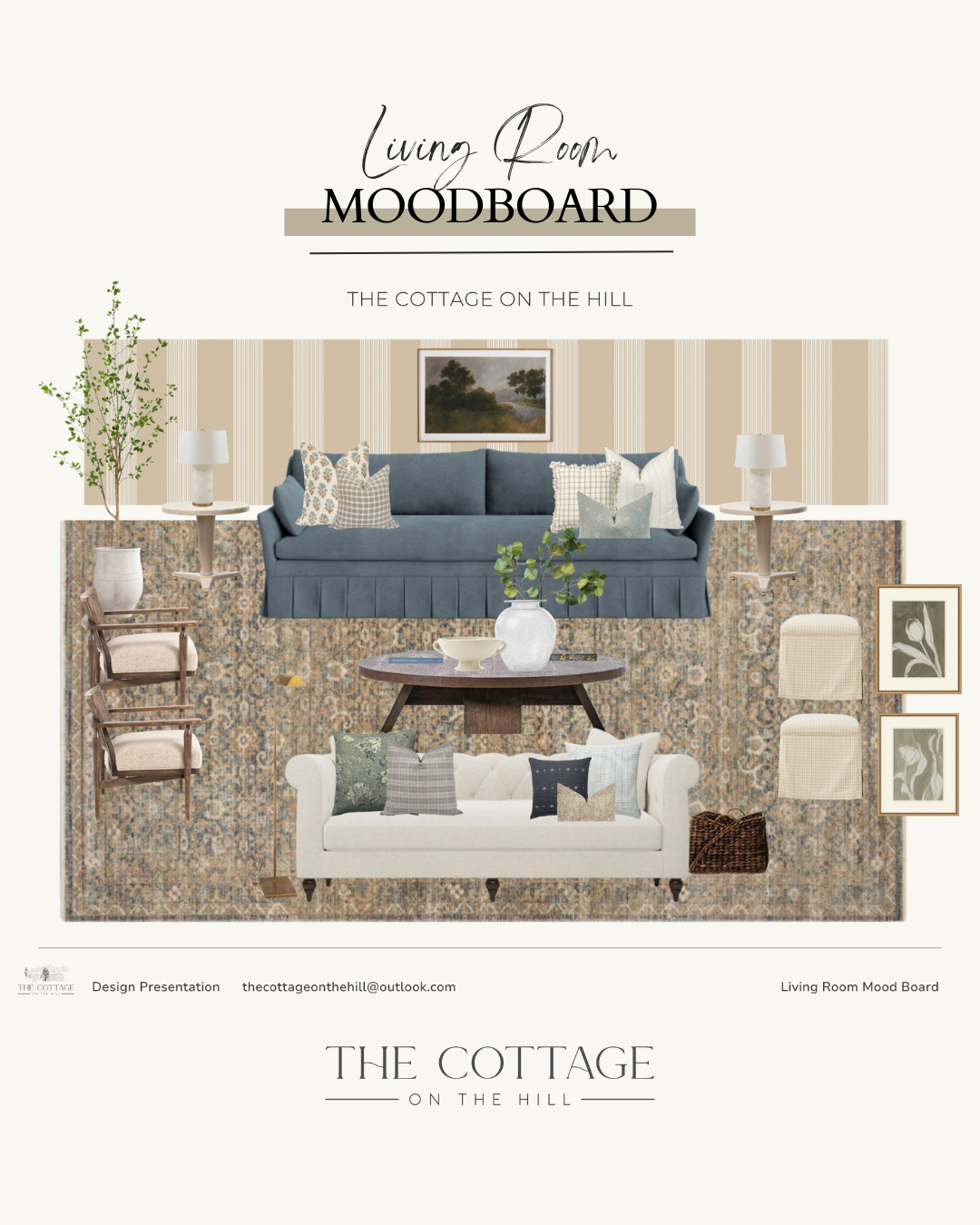
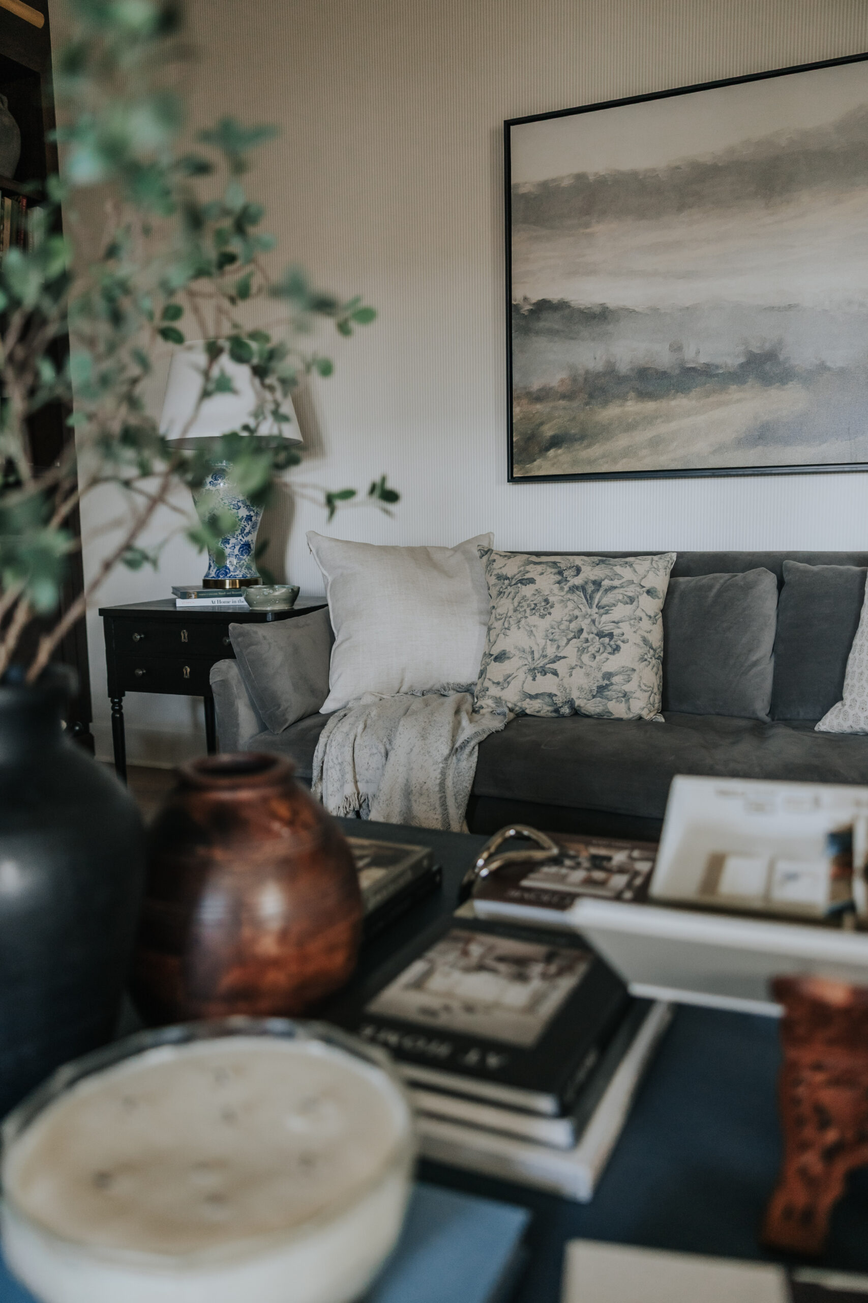
A living room with a blue-gray sofa as the anchor, warm neutral walls, a Persian-style rug in muted warm tones, and natural wood furniture. The blue sofa brings a cool, grounding element that keeps the space from feeling too warm or heavy. The walls and rug provide warmth and texture. Wood coffee and side tables add organic richness. Cream and neutral pillows bridge the temperatures beautifully. The result: a room that feels both restful and inviting, calm yet full of character.
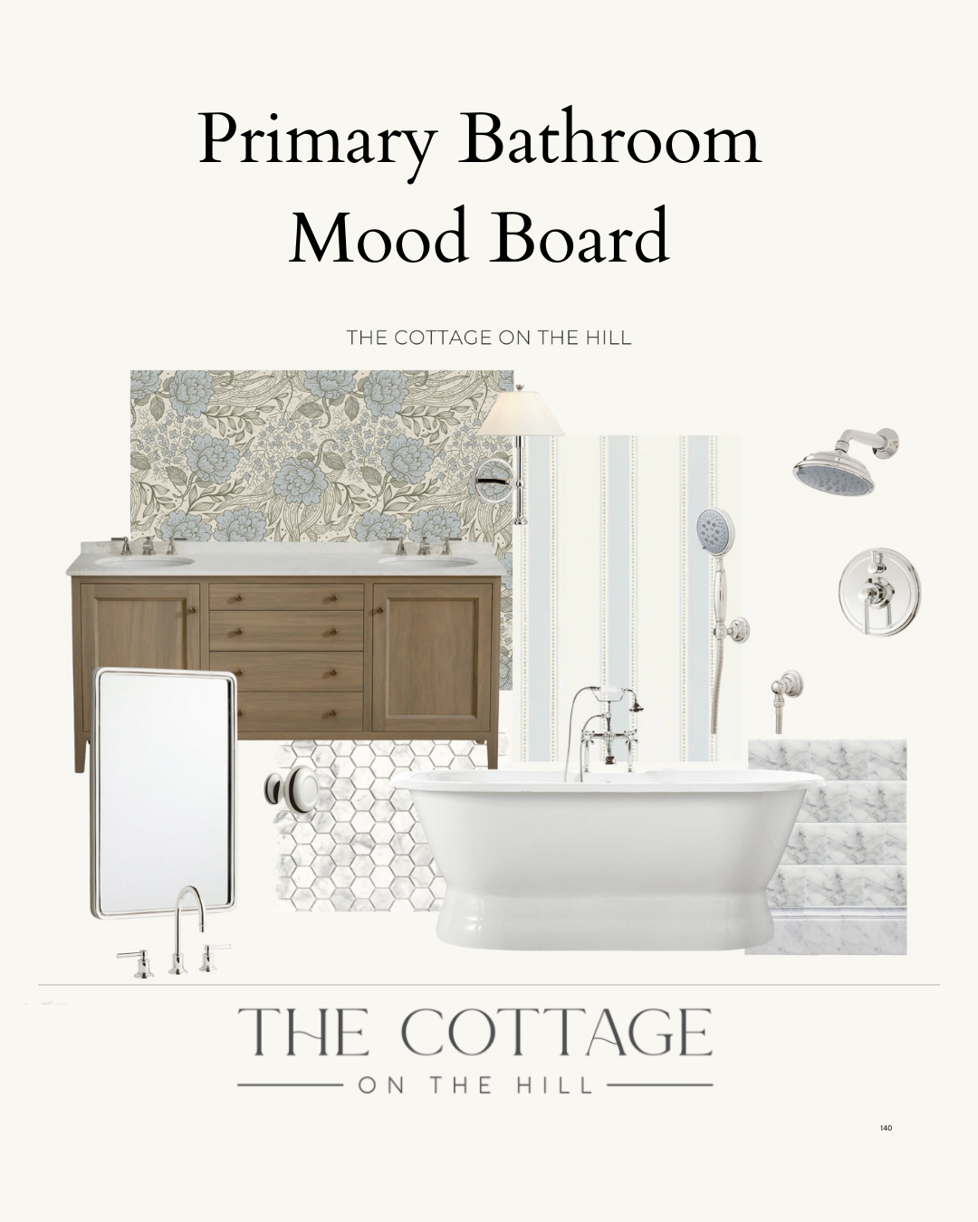
A bathroom with warm wood cabinetry, white subway tile or simple white tile in a pattern, polished nickel plumbing fixtures, and brass or gold hardware and mirror. The white tile creates a clean, spa-like backdrop. The wood vanity brings soul and organic warmth. The mix of metals—cool nickel for function, warm brass for beauty—creates subtle contrast. The result: a space that feels fresh and timeless, elegant but approachable, clean but not clinical.
The most beautiful rooms are the ones where warm and cool tones dance together effortlessly.
The Feeling of Balance
When you get the balance of warm and cool tones right, you feel it immediately.
The room doesn’t feel heavy or overwhelming. It doesn’t feel cold or uninviting. It feels just right—grounded yet light, cozy yet clear, timeless yet alive. You want to be in it. You can breathe in it. It settles you rather than stimulating you.
This is the magic of tonal balance. It’s not about following rules or achieving perfect proportions. It’s about creating harmony—a space where every element supports the others, where warmth and coolness work together to create something more beautiful than either could achieve alone.
That’s the art of it. And like any art, it takes practice, observation, and a willingness to trust your eye and adjust as you go.
When the balance is right, you feel it—the room simply settles into place.
Looking for pieces that help you balance warm and cool tones? Head to my LTK for hardware, textiles, and foundational elements in both temperature ranges.
