


There are certain paint colors I return to in project after project, home after home, room after room. Not because they’re trendy or because they photograph well, but because they work. They feel calm, timeless, and quietly beautiful in almost any light. They create a foundation that allows you to layer in personality without the space ever feeling dated or overwhelming.
These aren’t colors that demand attention. They’re colors that support life—that make a room feel finished without being precious, that work with your furniture and art rather than competing with them, that look just as beautiful in five years as they do the day you paint them.
I’ve used each of these colors in my own home and in countless client projects. They’ve proven themselves again and again. Not fleeting. Not overpowering. Just beautifully grounded neutrals that layer effortlessly with stone, wood, and lived-in details.
If you’re standing in the paint aisle feeling overwhelmed, start here.
Alabaster by Sherwin-Williams (SW 7008)
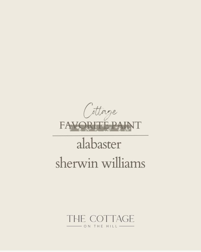
This is my desert island white—the one I’d choose if I could only choose one.
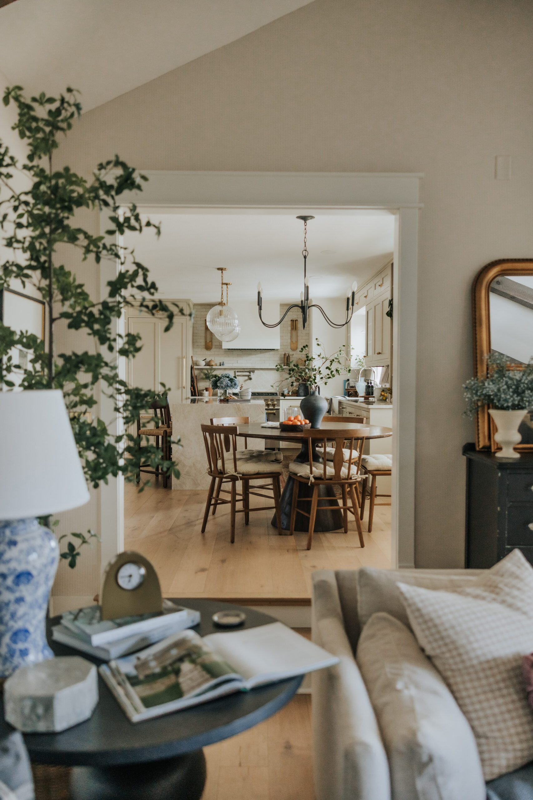
Alabaster is a warm, creamy white that supports other materials beautifully without ever feeling stark. It has just enough warmth to feel inviting without reading as dingy or dated. In natural light, it glows. In lower light, it feels cozy rather than flat.
I’ve used Alabaster in our kitchen and breakfast nook, and it’s the color I recommend most often for main living spaces, kitchens, and anywhere you want a fresh, clean backdrop that still feels warm. It works beautifully with both warm wood tones and cooler accents, which is part of its magic—it’s a true neutral that plays well with everything.
Alabaster is the warm white that works everywhere—clean but never cold.
Sandbar by Sherwin-Williams (SW 7547)
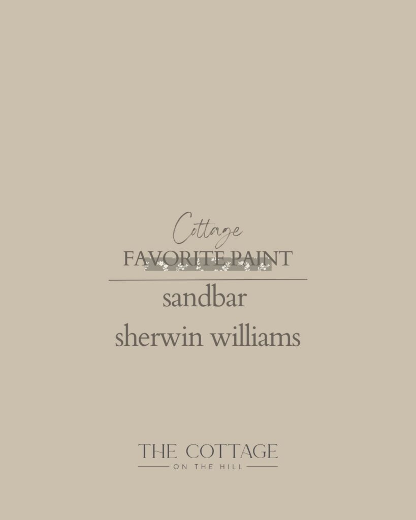
A warm, creamy neutral that brings softness and cohesion without washing a space out.
Sandbar has slightly more depth than Alabaster while maintaining that same warm, approachable quality. It’s the color you choose when you want something that feels grounded and substantial but still light and airy. Beautiful in bedrooms, hallways, or as a whole-home neutral that creates flow from room to room.
This color works particularly well when you want to create a soft, tonal backdrop that lets your furnishings and architectural details take center stage.
Sandbar brings warmth and cohesion—substantial but still soft and inviting.
Accessible Beige by Sherwin-Williams (SW 7036)
This is the greige that actually works.
Accessible Beige is a soft, warm neutral that sits perfectly between gray and beige. It has enough warmth to feel inviting but enough gray to feel current and sophisticated. It’s never muddy, never flat, and works beautifully in spaces that need a grounded, neutral backdrop.
I’ve used this color in a girl’s bedroom, and it created the perfect calm, cozy foundation for layering in color and pattern. It’s also wonderful in living rooms, bedrooms, and anywhere you want a neutral that’s more substantial than white but still soft and approachable.
Accessible Beige is the greige that feels grounded, warm, and endlessly versatile.
Antique Pewter by Benjamin Moore (HC-183)
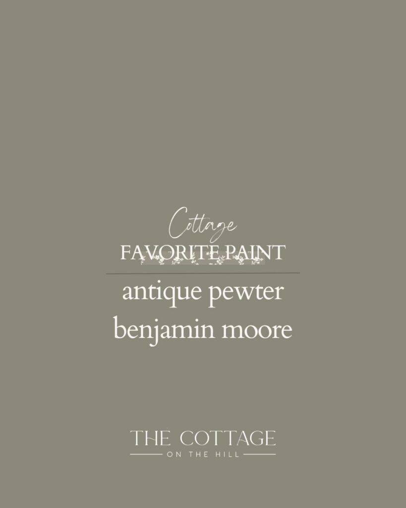
A soft green-gray that reads calm and classic, especially in natural light.
Antique Pewter is one of my favorite whole-home neutrals because it brings just enough color to feel interesting without ever feeling bold or trendy. The green-gray undertones shift beautifully throughout the day—sometimes reading more gray, sometimes showing hints of soft sage.
This is the color for someone who wants to move beyond beige and white but isn’t ready for a true color commitment. It’s sophisticated, serene, and works with nearly everything.
Antique Pewter is calm and classic—one of the best whole-home neutrals.
Keystone Gray by Sherwin-Williams (SW 7504)
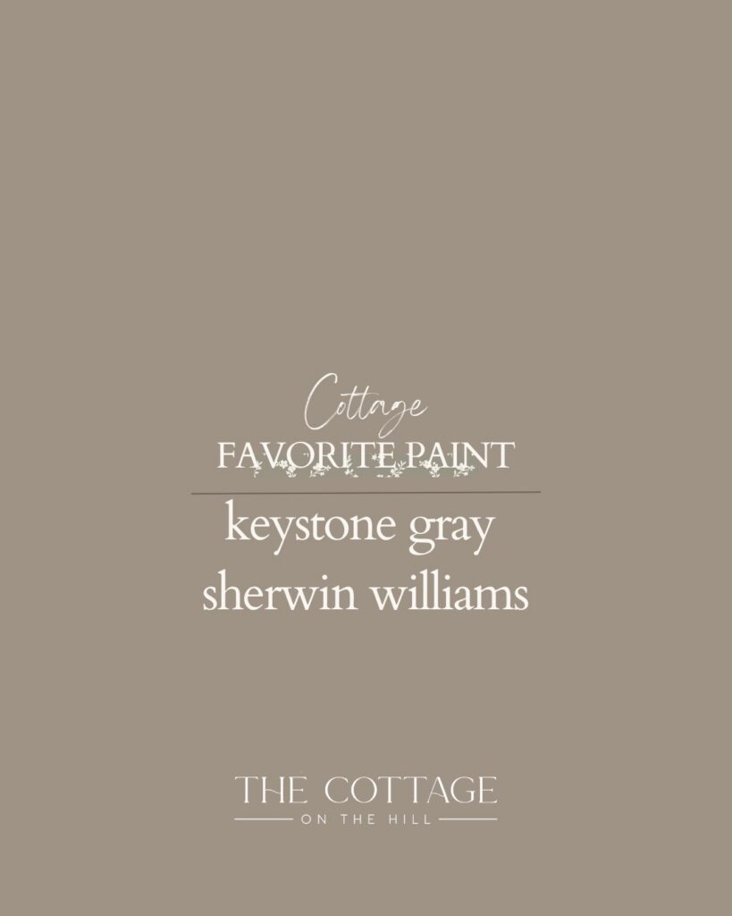
A warm gray with gentle taupe undertones—incredibly versatile and easy to live with.
Keystone Gray has presence and sophistication without being dark or moody. The warm taupe undertones keep it from ever feeling cold or flat, which is what makes it so livable. I’ve used it in a formal dining room, and it created exactly the kind of elegant, timeless atmosphere I was after.
This color works beautifully when you want a bit more depth than a typical gray but still want the room to feel sophisticated and neutral. Pair it with crisp white trim for classic contrast, or keep everything tonal for a more modern look.
Keystone Gray brings sophistication with warmth—a true gray that never feels cold.
Cadet by Sherwin-Williams (SW 9143)
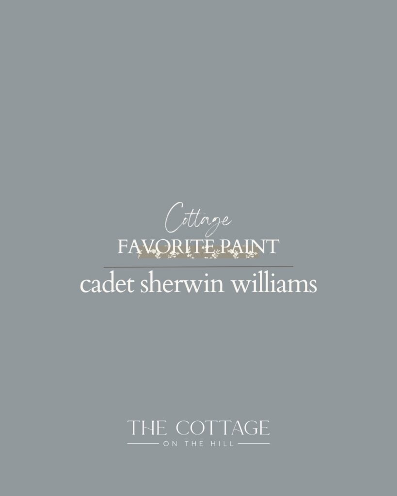
A muted blue-gray that feels tailored and serene, especially lovely in bedrooms or studies.
Cadet is for the moments when you want actual color but still want the calm of a neutral. The blue-gray tone is sophisticated and restful—perfect for spaces meant for quiet and focus. It reads cool but never cold, especially when balanced with warm wood tones and soft textiles.
I love this color in bedrooms where you want a serene atmosphere, or in home offices and libraries where you want something that feels a bit more intentional than plain gray.
Cadet feels tailored and serene—color that still acts like a neutral.
Brainstorm Bronze by Sherwin-Williams (SW 7033)
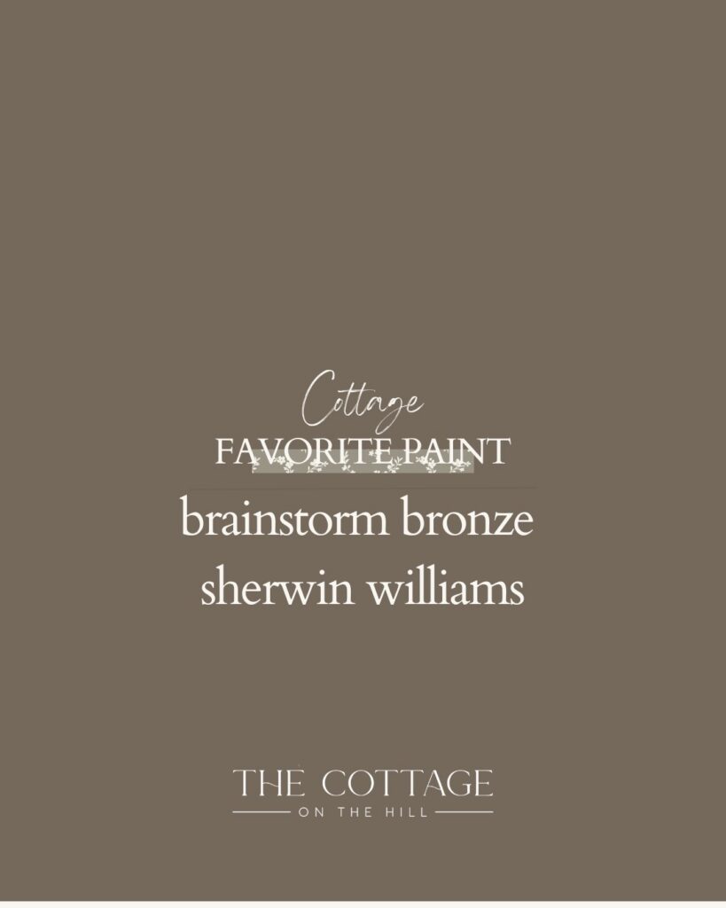
A warm, earthy brown with subtle richness—perfect for spaces that want to feel grounded and cozy without feeling dark.
Brainstorm Bronze is for those who are ready to embrace color with warmth and confidence. It’s a brown that doesn’t read as heavy or dated—instead, it feels organic, grounding, and deeply intentional. Beautiful in dining rooms, libraries, or as an accent wall that anchors a space.
This color works especially well when paired with natural materials—wood, stone, linen—and brings a level of coziness that’s hard to achieve with cooler tones.
Brainstorm Bronze is grounded and cozy—warm color that feels timeless, not trendy.
Black Fox by Sherwin-Williams (SW 7020)
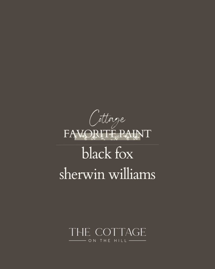
Deep and enveloping, with warmth underneath—a color that adds depth while still feeling timeless and livable.
Black Fox is my choice when a space needs drama but not harshness. It’s deep enough to create intimacy and richness, but the warm undertones keep it from feeling too severe. Stunning in powder bathrooms, on feature walls, or in smaller spaces where you want to create atmosphere.
Unlike a true black, Black Fox has dimension and warmth that make it feel collected rather than stark. It’s the kind of color that makes a statement while still feeling grounded.
Black Fox creates depth and drama—enveloping but never harsh.
Peppercorn by Sherwin-Williams (SW 7674)

A true charcoal that creates contrast without harshness—beautiful on doors, cabinetry, or millwork moments.
Peppercorn is my go-to dark neutral for small, impactful spaces or architectural details that deserve emphasis. It’s dramatic without being overwhelming, and the warm undertones keep it from reading as stark black. Perfect for powder bathrooms, accent walls, painted doors, or cabinetry that needs to stand out.
I used Peppercorn in a powder bathroom, and the transformation was stunning. Dark paint in a small space creates coziness and makes the room feel intentional and special. Balance it with beautiful lighting and warm metals, and the space comes alive.
Peppercorn creates contrast and drama—perfect for moments that deserve to stand out.
How to Choose the Right Color for Your Space
These colors are my workhorses, but knowing which one to use where makes all the difference.
For main living areas and kitchens: Start with Alabaster or Sandbar if you want warmth. These colors create a clean, timeless backdrop that allows your furniture, art, and life to take center stage.
For bedrooms: Accessible Beige creates a soft, grounding atmosphere. Cadet brings serene, sophisticated color. Both work beautifully for rest.
For whole-home neutrals: Antique Pewter and Keystone Gray bring enough color to feel interesting while maintaining neutrality throughout.
For formal spaces or depth: Keystone Gray, Brainstorm Bronze, or Black Fox bring sophistication and richness. They work beautifully in dining rooms, libraries, or any space where you want presence.
For small, impactful spaces: Peppercorn or Black Fox transform powder bathrooms, accent walls, or architectural details into something special.
The right color depends on the room’s purpose, light, and the feeling you want to create.
Consider Your Light
Paint color is never just about the color itself—it’s about how that color interacts with the light in your space.
North-facing rooms receive cooler, bluer light. In these spaces, lean toward warmer colors like Alabaster, Sandbar, Accessible Beige, or Brainstorm Bronze to counteract the coolness.
South-facing rooms get warm, golden light. Here, you can go cooler with Cadet or Antique Pewter, or richer with Black Fox or Peppercorn, and the warmth of the light will balance it beautifully.
East-facing rooms have warm morning light and cooler afternoon light. West-facing rooms are the opposite. Think about when you use the room most and choose accordingly.
Always—and I mean always—test your paint color in the actual space before committing. Paint large swatches on multiple walls and observe them at different times of day. What looks perfect at noon might feel off at 7 PM.
Light changes everything—test your color in your actual space before painting.
The Power of Consistency
One of the reasons I love these specific colors is that they work beautifully together throughout a home.
You can use Alabaster in the kitchen, Accessible Beige in the bedrooms, Keystone Gray in the dining room, and Antique Pewter in the hallway—and the home will feel cohesive and intentional. These colors share undertones and harmonize naturally, creating flow from room to room.
This doesn’t mean your entire house has to be painted in only these colors. But having a consistent palette of go-to neutrals creates a sense of calm and cohesion that makes a home feel collected rather than disjointed.
Cohesion comes from a consistent palette—choose a few colors and use them thoughtfully throughout.
Don’t Forget About Finish
The sheen you choose affects how the color reads almost as much as the color itself.
For walls, I almost always recommend eggshell or satin. These finishes are durable, easy to clean, and have just enough subtle sheen to reflect light beautifully without looking shiny.
For trim, doors, and cabinetry, semi-gloss or satin works beautifully. Semi-gloss is more traditional and creates a nice contrast with matte or eggshell walls. Satin is softer and more modern but still durable.
For ceilings, flat or matte is usually best. It hides imperfections and keeps the ceiling from drawing attention.
Finish matters—choose the right sheen for the right surface.
Trust the Process
Choosing paint colors can feel overwhelming, but it doesn’t have to be.
Start with these tried-and-true colors. Consider your light. Think about the feeling you want to create. Test before you commit. And remember that paint is one of the most forgiving design decisions you can make—if you don’t love it, you can change it.
These colors have served me well for years, and I trust them to do the same for you. They’re not flashy or trendy. They’re just quietly, reliably beautiful—the kind of colors that make a house feel like a home.
The best paint colors are the ones you don’t think about—they just feel right.
Why These Colors Work
What ties all of these colors together is their timelessness.
They’re not chasing trends. They’re not trying to make a statement. They’re simply creating a beautiful, calm backdrop for the life you’re living. They work with nearly any style—traditional, modern, transitional, cottage, farmhouse. They pair beautifully with both warm and cool accents. And they’ll look just as good in ten years as they do today.
That’s the kind of paint color worth investing in. Not the one that looks exciting in the moment but feels dated in two years. The one that quietly supports everything else in the room, that makes your furniture look better, that allows your art and textiles to shine.
These are those colors. And they’re the ones I’ll keep recommending, again and again.
Timeless paint colors don’t demand attention—they create space for everything else to shine.
Ready to transform your space with paint? Head to my LTK for paint supplies, swatches, and the tools you need to get started. Here’s to creating a home that feels calm, timeless, and unmistakably yours.