


How to Welcome the Season Without a Full Room Overhaul
There’s a certain restlessness that comes with spring. The light shifts, the days stretch longer, and suddenly your home — which felt so cozy and warm just a few weeks ago — starts to feel a little heavy. A little dark. Like it’s ready for something lighter, too.
The good news? You don’t need to repaint a single wall or reupholster a single piece of furniture to feel that shift. The most beautiful spring transitions happen in the details — the small, intentional swaps that lighten the visual weight of a room and invite the season in without starting over.
Soft spring color isn’t about going bold or decorating with obvious seasonal clichés. It’s about introducing the quiet tones of the season — the muted sage, the warm cream, the dusty blush, the soft sky blue — in the layers that are easiest to change. Pillows, throws, florals, ceramics, textiles. The pieces that move in and out with the seasons naturally.
Let me walk you through exactly how to do it, layer by layer.
Start with Your Palette: The Soft Spring Color Story
Before you swap a single thing, decide on your color direction. Spring color done well isn’t a rainbow — it’s a quiet, cohesive story told in two or three tones that work beautifully together.
The soft spring palette: Think muted rather than saturated. Warm cream and aged white as your neutral foundation. Soft sage and dusty eucalyptus for organic warmth. Pale sky blue and dusty chambray for freshness. Warm blush and antique rose for softness. Soft butter yellow used sparingly as an accent. These colors feel like spring without screaming it.
Choose two or three tones and repeat them: Pick a primary soft neutral, one soft color, and one accent. Then repeat those tones across every layer you introduce — your throw, your pillow, your florals, your ceramics. Repetition is what creates a collected, intentional look rather than a scattered one.
Let your existing space guide you: Look at what’s already in your room — your sofa color, your rug, your wall color — and choose spring tones that complement rather than compete. A warm-toned room calls for soft sage and cream. A cooler-toned room welcomes dusty blue and warm white beautifully.
Two or three soft, muted tones repeated across every layer creates a spring palette that feels cohesive and intentional.
Layer One: Pillows — The Easiest Swap with the Biggest Impact
If you do nothing else for spring, swap your pillows. No single change makes a faster, more visible difference in how a room feels.
Why pillows work so well: They sit front and center on your sofa, your bed, your reading chair — wherever the eye naturally lands. Changing them immediately shifts the feeling of the entire space, even when nothing else has moved.
What to swap in: Trade heavier, darker pillow covers for lighter linen or cotton options in your spring palette. Soft sage linen, warm cream cotton, dusty chambray, muted blush — these fabrics and colors instantly lighten the visual weight of a room. Look for subtle texture — a woven linen, a gentle stripe, a delicate embroidered detail — rather than bold pattern.
How to layer them: Keep your existing pillows if they’re neutral enough, and simply add one or two spring-toned covers into the mix. You don’t have to replace everything — layering a soft sage linen pillow with your existing cream and warm white pillows creates that fresh, collected feeling without starting over.
Vary the sizes: A mix of sizes — a larger 22×22 pillow behind a smaller 18×18, with a lumbar in front — adds dimension and that effortlessly layered quality that makes a sofa or bed look truly styled.
Pillow covers are the fastest, most impactful spring swap — choose linen and cotton in soft, muted spring tones for an immediate seasonal shift.
Layer Two: Throws — Lighten the Weight
Throws are another easy swap that significantly changes how a room feels as the season shifts.
Why it matters: A chunky knit throw in a deep neutral reads as winter. A lightweight linen throw in a soft sage or warm cream reads as spring. Same function, completely different feeling.
What to look for: Trade heavier knits and woven wool throws for lighter weight options — linen, cotton gauze, a lightweight waffle weave. These materials feel airy and fresh while still adding that essential layer of softness and texture.
Color and tone: Your throw is another opportunity to repeat your spring palette. A soft sage throw draped over one arm of the sofa, a warm cream linen throw at the foot of the bed — these quiet color moments add up across the room and reinforce that cohesive spring feeling.
How to style them: Don’t fold throws perfectly — drape them. Casually toss one over the arm of a chair, let one puddle slightly at the end of a bed, loosely fold one over a basket beside the sofa. The lived-in quality is part of what makes a space feel warm and collected rather than staged.
Swap heavy knits for lightweight linen and cotton throws in soft spring tones — the material shift alone changes how a room feels.
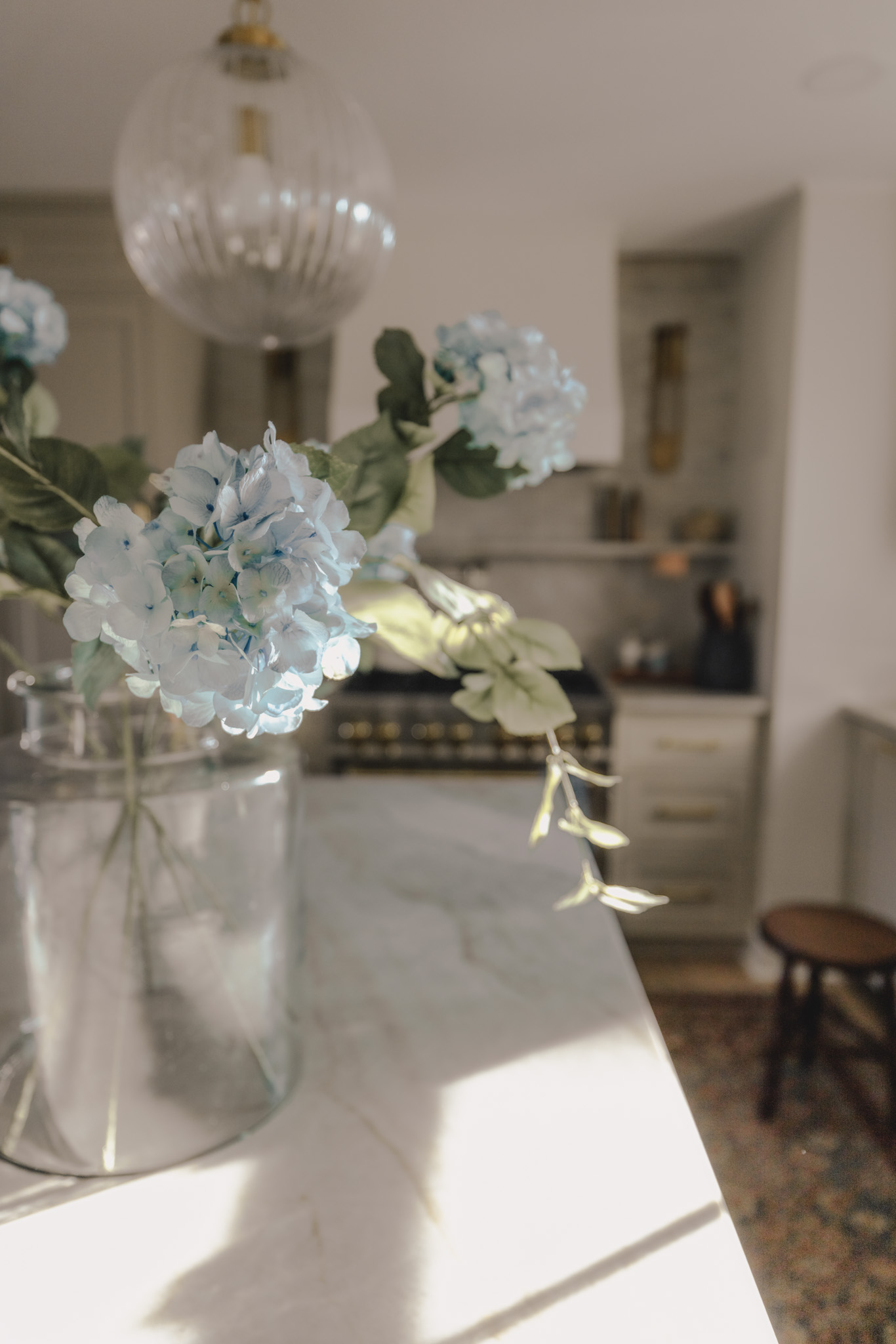
Layer Three: Florals and Greenery — Bring the Outside In
Nothing signals spring more immediately than fresh florals and greenery. This single layer has the power to transform a room’s entire feeling.
Why it matters: Living elements bring color, movement, life, and organic warmth that no purely decorative object can replicate. They connect your home to the season happening just outside your windows.
Fresh stems: Spring is the season of tulips, ranunculus, peonies, garden roses, and soft branches just coming into bloom. A simple bouquet of white tulips in a ceramic vase, a handful of garden roses in a wide-mouthed pitcher, a few stems of eucalyptus tucked into a tall vessel — these simple moments are among the most beautiful things you can do for a spring room.
Greenery as a neutral: Fresh greenery — olive branches, eucalyptus, simple garden clippings — works like a neutral in a spring palette. It adds organic warmth and color without competing with the soft tones you’ve layered in elsewhere. Keep stems simple and loose rather than tightly arranged.
The vessel matters: Display your florals and greenery in vessels that complement your spring palette. A cream ceramic vase, a warm white pitcher, a soft sage or dusty blue pot — the container is part of the moment. Choose warm, organic materials that feel collected rather than generic.
Vary heights and locations: Don’t limit florals to one room. A small bud vase on a windowsill, a larger arrangement on the dining table, a simple stem in a vase on a bathroom shelf — scatter small floral moments throughout the home and the whole space feels spring-touched.
Fresh florals and greenery in beautiful vessels are the most immediate, irreplaceable signal of spring — scatter them throughout the home in varying heights and scales.
[Cottage Favorites or Decorative Accents image — vases, vessels, ceramics in spring-appropriate tones]
Layer Four: Ceramics and Vessels — Swap for Softer Tones
Your decorative vessels, vases, and objects carry more color than you might realize. Swapping even a few for spring-toned versions makes a quiet but meaningful difference.
Why it matters: The ceramics and vessels displayed on your shelves, coffee table, and console are always in your field of vision. Shifting them to softer, lighter tones contributes to the overall spring palette in a way that feels collected and intentional.
What to swap in: Look for ceramics in soft sage, warm cream, dusty blue, muted terracotta, and aged white. Handmade or hand-finished pieces with subtle variation in glaze add that organic quality that feels gathered rather than purchased. A soft sage handled vase, a wide cream ceramic bowl, a dusty blue pot with a simple silhouette — these pieces carry spring color quietly and beautifully.
Style them in groupings: Cluster two or three vessels together in complementary spring tones and varying heights. A tall cream vase beside a shorter sage pot with a small ceramic bowl in front — this simple grouping becomes a spring color moment without a single word needed.
Don’t replace everything: The goal isn’t to swap out every decorative object in your home. Choose one or two key surfaces — your coffee table, your main shelf grouping, your console — and refresh the vessels there. Let those curated moments do the work for the whole room.
Soft-toned ceramics and vessels in sage, cream, and dusty blue carry spring color quietly across your shelves and surfaces.
Layer Five: Table Linens and Kitchen Textiles — Don’t Overlook the Details
The kitchen and dining spaces are easy to overlook in a seasonal refresh, but small textile swaps here make a meaningful contribution to the overall spring feeling of your home.
Why it matters: You interact with your kitchen and dining textiles multiple times a day — dish towels, napkins, a table runner, placemats. These small details are touched and seen constantly, and shifting them to spring tones adds up more than you’d expect.
What to swap in: Trade darker or heavily textured kitchen textiles for lightweight linen options in soft spring tones. A cream linen dish towel with a simple stripe, soft sage linen napkins, a warm white table runner with a subtle texture — these details feel quietly seasonal without being obvious.
The table as a spring moment: Even on an everyday basis, your dining table can carry a soft spring palette. A linen runner in a warm neutral, a small vase of fresh stems in the center, linen napkins in a soft complementary tone — this simple, understated table setting makes every meal feel like a spring occasion.
Look for natural fibers: Linen and cotton are the natural fibers of spring. They feel lighter, softer, and more relaxed than heavier materials. In spring tones, they’re the perfect textile for every surface they touch.
Linen dish towels, napkins, and table runners in soft spring tones bring the season into the spaces you use most.
Layer Six: Candles and Scent — The Invisible Layer
Spring color isn’t only visual. Scent is one of the most powerful ways to signal a seasonal shift — and it’s a layer most people forget entirely.
Why it matters: The moment you light a candle that smells of fresh greenery, light florals, or clean linen, the whole room shifts. Scent creates an immediate, almost subconscious association with the season.
What to choose: Swap heavier, warmer winter scents — amber, vanilla, woodsmoke — for lighter spring options. Fresh cut stems, green tea, soft white florals, clean linen, light citrus — these scents feel like open windows and garden mornings. Choose candles in vessels that complement your spring palette — cream, sage, warm white — so even unlit they contribute to the color story.
Style them intentionally: A candle isn’t just functional — it’s decorative. Tuck a cream pillar candle into a spring shelf vignette, cluster a few small votives on a tray on your coffee table, place a beautiful candle on your bedside table. When they’re lit, they add warmth and atmosphere. When they’re not, they add color and texture.
Scent is spring’s invisible layer — swap heavy winter fragrances for light florals and clean greens to shift the feeling of a room immediately.
Bringing It All Together
The beauty of a layer-by-layer approach is that you don’t have to do everything at once. Start with one layer — a pillow swap, a fresh bouquet, a new linen throw — and notice how much that single change shifts the feeling of the room. Then add another layer when you’re ready.
This is how spaces come to feel truly collected and intentional rather than done all at once. Each layer builds on the last, and the whole becomes something greater than the sum of its parts.
The soft spring palette you’re building — in cream, sage, dusty blue, soft blush — will work across every room, every surface, every textile. Keep the tones muted and the materials natural. Repeat your colors across layers. Leave room for the season to come in quietly rather than arriving all at once.
That’s how spring finds its way into a home. Not through a renovation or a full room overhaul — but through a bouquet of tulips, a linen throw in soft sage, a ceramic vase in warm cream, and a candle that smells like an open window on a warm morning.
Ready to bring soft spring color into your home? Head to my LTK for all the pillows, throws, florals, ceramics, linens, and candles that make a seasonal refresh feel effortless and beautiful.
